LifeStyle BigCommerce Theme Manual
LifeStyle BigCommerce Theme
LifeStyle is a free BigCommerce Stencil theme developed by PSDCenter. This Stencil theme can be used by various industries like fashion accessories, electronics, retail, automobile, clothing, and many more. You can check out the live demo of LifeStyle from the link below.
Theme Features
- We provide you totally custom based admin panel so you can control your store’s look & feel even if you don’t have the knowledge of HTML or CSS.
- Faceted Search Facility: Our theme supports Advanced search filtering (Faceted Search functionality).
- Additional notification tags like “Sale” labels that will automatically highlight products, which have SALE prices added to them.
- Product Display View: Here you can select the display view of product items, you can choose Grid View or List View. This will be applied to the Category and Search page section only.
- Product Lazy Loading: We have added lazy loading to the product images which will let the users have a pleasant experience. Lazy loading is a technique that loads images that user would need at a later stage of page scrolling. The method offers a great user experience with an optimized store.
- The LifeStyle theme comes with beautiful hover effects based on CSS3, which give your users amazing surfing experience.
How to apply the LifeStyle theme?
If you’ve already purchased a LifeStyle theme, it will be automatically installed when you log into your BigCommerce dashboard. You’ll find all of your themes by navigating to Storefront > My Themes. Your Current Theme will be displayed at the top, and any previously installed or purchased themes will appear below it.
If you want to publish a theme that is currently inactive, simply select it and click on Apply on the next screen. Once you click Apply on the following screen, it will be installed on your store.
Store Design
Once you’ve installed/applied your theme, it’s time to personalize and make it your own. While all of your products, categories, pages, and marketing (including the slideshow) will be configured from BigCommerce dashboard, most of the changes you make for the look & feel of the store will take place from the store design.
You’ll access it by navigating to Storefront > My Themes, and then clicking the blue Customize button under Current Theme. You’ll notice that the theme editor sidebar menu is divided into a variety of sections like:
- Styles
- Global Theme Settings
- Header & Footer
- Homepage
And more…
We’ll walk through each as they appear in Store Design:
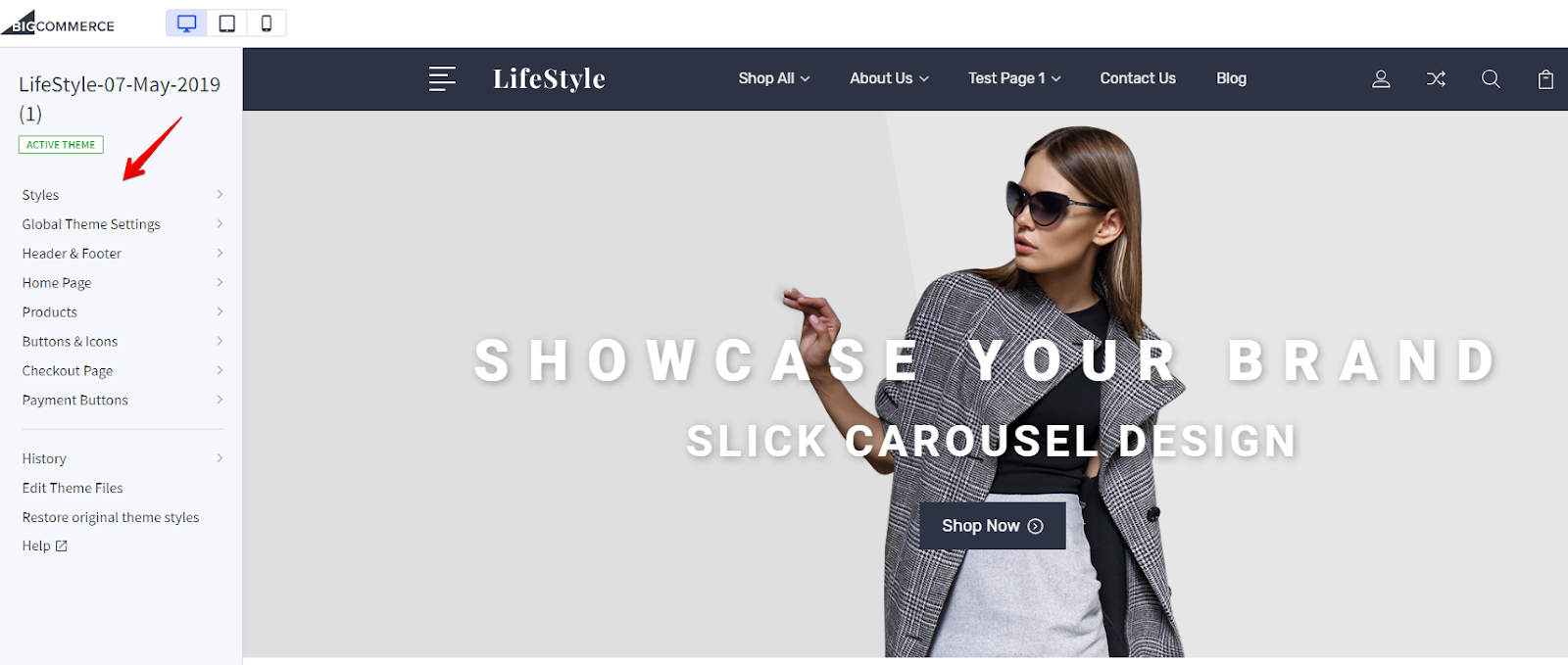
Global Theme Settings
In Global Theme Settings, you can make some of the essential changes to your theme. Here are some of the settings that you can explore in this menu:
- Theme primary color.
- Background and lines colors.
- Body text and links fonts (Rubik/Roboto).
- Heading font & color.
- Loading indicators colors.
- Hide breadcrumbs, page headings, category page heading, blog page heading, and contact us page heading.
- Manage the size of the blog images.
- The show price range for products with variants.
- Hide purchase options (price, and add-to-cart) for logged out users.
- Form input fields colors.
Header & Footer
From this menu, you can make essential changes in the header and footer section. Here’s an overview of some of the settings:
- Change header background (currently #2E3344).
- Enable sticky header
- Set up logo dimensions, font size, and text color.
- Change utility navigation (Account, Compare, Search, Add-to-cart) settings. Basically, the right corner of the header covering all the important options.
- Main header navigation settings like text color, text hover color, etc.
- Enable social media icons.
- Add logo, email address, and time in the footer.Note: To add Logo, first you need to upload the Logo image in the Image Manager from Storefront of admin settings. Then, you have to copy and paste the name of the image (with extension) in the Footer logo field.
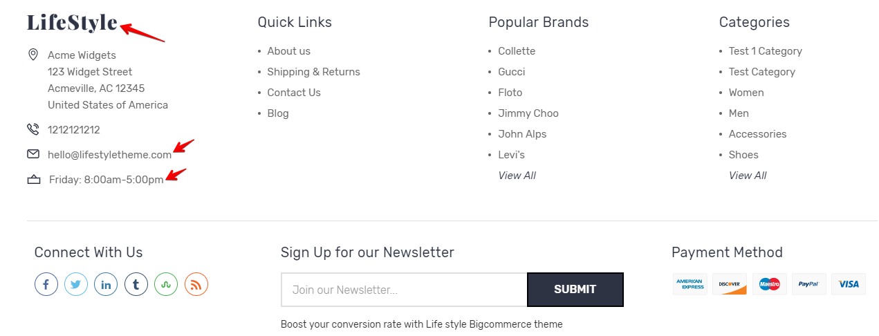
- Change footer background, heading color, text color, and text hover color.
- Enable credits like “Powered by BigCommerce” and “Themes by PSDCenter.”
- Showcase brand names, copyright symbol, current year, store name.
- Enable Payment provider icons & Add “Apple Pay” button.
- Set GeoTrust SSL seal & its size in the footer section.
Home Page
You can perform below actions from the Home Page menu admin panel:
- Enable carousel and arrows on slides.
- Enable images to stretch on large screens.

- Set up title color, description color, button background color, button text color, of carousel slides. You can add up to 5 slides, and the images can be added from the path:Color settings: Editor > Home Page > Carousel.
Image Settings: Store Admin > Storefront > Homepage Carousel - Add homepage promotional banner images. There are four promotional banners, and you can add URLs and images of all four banners from this setting. Please note that homepage promotional banners are marked off by default.
 If you wish to use the images shown above, you can follow the drive URL below:
To add promotional images, first you need to upload the files in the Image Manager from Storefront of admin settings. Then, you have to copy and paste the name of the image (with extension) in the banner image fields. You can use the images provided in the drive URL or images of your choice as well.
For the best results, use these recommended dimensions for promotional banner images:
Banner1: 705×560 px
Banner2: 705×265 px
Banner3: 337×265 px
Banner4: 337×265 px - Main Title Settings
- Edit Featured Product Subheadings on the home page
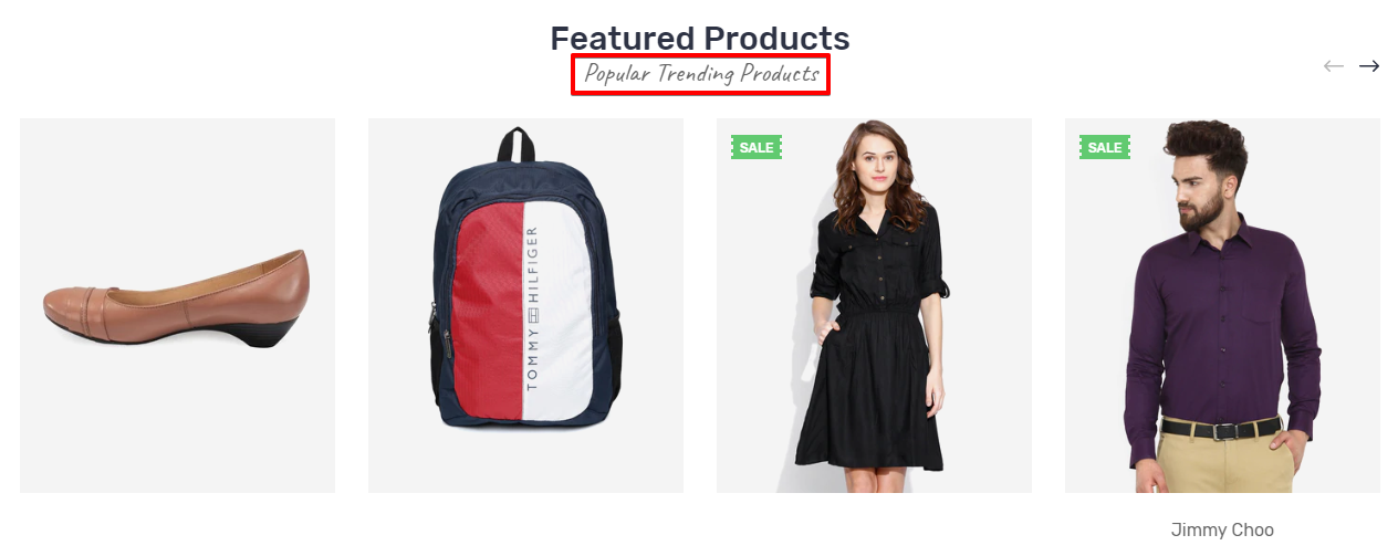
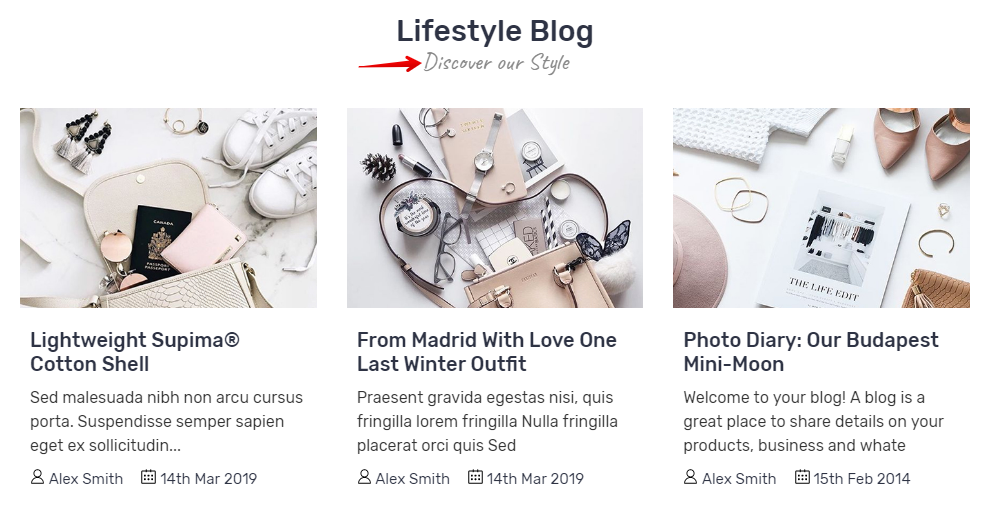
- The blog section is by default turned off in BigCommerce, so to showcase your blogs on the homepage, you have to follow the below path and turn on the visibility:
Storefront > Blog
 After enabling the blog section from this path, you can change the subheading of the blog section on the homepage.
- Choose the no. of products to show in the following sections:
Featured Products Section (Max 12)
Most Popular Products (Max 12)
No. of New Products (Max 12) - Add up to 4 USPs of your store, title, and images. Unique Selling Propositions (USPs) are the unique qualities or features your business has that your competitors might not. USPs help businesses boost sales or acquire more customers. The USP section on the homepage is set to disable by default. You have to access this setting and add icons & descriptions to showcase USPs on the homepage.
There are two ways you can use USP icons:
Use ready-made icons from LifeStyle theme:
We have created 36 most useful USP icons, that you can choose from the dropdown of each USP.
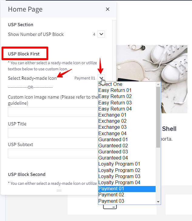
Below is the image showing how each image will look like with names:

User personal icons:
To add USP images, first you need to upload the files in the Image Manager from Storefront of admin settings. Then, you have to copy and paste the name of the image (with extension) in the USP image fields.
Here’s how your store would look like after utilizing USP icons:

Products
The Product menu allows you to modify and setup product pages according to your needs. Here are some important settings that you can make from this menu:
- Show Sale Price Labels of Before and After. Also, showcase the retail price label. To showcase the sale label, we have three styles: Top Left, Diagonal, and Burst.
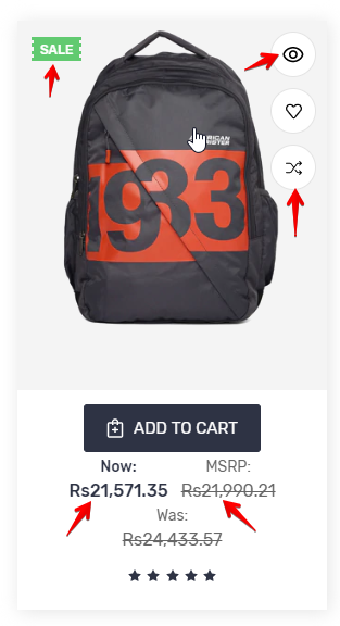
- Enable Display settings like
- Quick View on Product Cards
- Compare button
- Quantity selection on product pages
- Product weight & dimensions
- Show “Shop by Price” in filters
- Product reviews
- Set up no. of products for
- Category page (Max. 20)
- Brand page (Max. 20)
- Search result page. (Max. 20)
- Related products (Max. 12)
- Customers Also Viewed Products (Max. 12)
- Change product card header text and header text hover colors.
- Change the background, border, and text colors in Quick Search.
- Set up custom image dimensions for main product images.
- Set up custom image dimensions for thumbnail product images in the cart.
- Set up custom image dimensions for thumbnail image in the cart and other pages.
- Set up custom image dimensions for product zoomed images.
- Set up custom image dimensions for product images in the gallery view.
- Set up custom image dimensions for brand image in the gallery view.
- Set up custom image dimensions for product swatch image dimensions.
Buttons & Icons
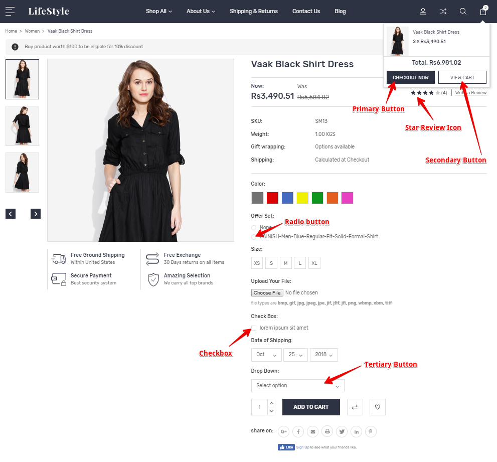
From this menu, you can change the properties like text color, text hover color, background color, border color, etc. of various buttons and icons like;
- Tertiary Action Button
- Disabled Button
- Social Media Icons, Review Icons, and Increase-Decrease button, etc.
- Checkboxes and Radio Buttons
Have a look at the image below to understand more:
Checkout Page
This setting lets you edit some important elements of the checkout page. Let’s have a look:
- Enable/disable background image in the header.
- Change the background color, text color, border color of the header.
- Position logo and style.
- Discount banner image properties.
- Order Summary Box properties.
- Check out steps properties.
- Heading fonts & text colors.
- Body page background & color.
- Body text and links properties.
- Primary & Secondary action button properties.
- Form input fields properties.
- Loading toaster properties.
History
History is very important in the phase of customization. BigCommerce keeps a record of every version you’ve saved, so you can apply previous versions whenever you need.

Review Us
If you like this theme, please support us by sharing your reviews and rating us 5 stars. To review our services or to give rate our theme, please follow this URL : https://partners.bigcommerce.com/directory/partner/129287/psdcenter.

