 Request for Support
Restrict Purchase to Login — It hides prices and add to cart buttons unless shoppers are logged in
Milano BigCommerce Theme Manual
Milano BigCommerce Theme
Milano theme has two variations that helps you to organize the fonts, colors, and general style of your store. You can check our store for demo and see the style of our Milano theme.
Theme Features
- We provide you totally custom based admin panel so you can control your store’s look and feel without having knowledge of HTML or CSS.
- Faceted Search Facility: Our theme supports Advanced search filtering (Faceted Search functionality).
- Additional notification tags like “Sale” labels that will automatically highlight products, which have SALE prices added to them.
- Product Display View: Here you can select the display view of product items, you can choose Grid View or List View. This will apply to Category and Search page section only.
- Product Lazy Loading: We have added lazy loading to the product images which will let the users have a pleasant experience while exploring the products.
- Product Image Change on Hover: This feature will let the customers have a look at a different image of the product from the set of images uploaded for that product.
- Milano theme comes with beautiful hover effects based on CSS3, which give your users amazing surfing experience.
How to upload theme?
If you haven’t purchased Milano Theme you can purchase it from the BigCommerce Theme Store. Here is the direct URL for same.
If you’ve already purchased your theme directly from BigCommerce, it will be automatically installed when you log into your BigCommerce dashboard. You’ll find all of your themes by navigating to Storefront Design > My Themes. Your Current Theme will display at the top, and any previously installed themes will appear below it.
If you want to publish a theme that isn’t currently installed, simply select it and click Apply on the next screen. If you have a theme from another source besides BigCommerce, you can click Upload Theme or either drag or upload it from your computer. Once you click Apply on the following screen, it will be installed on your store.
How to select a theme style
Milano comes with two unique theme styles that curate the fonts, colors, and general style of your store.
Check out our store demos to see the Default and Advance styles in action.
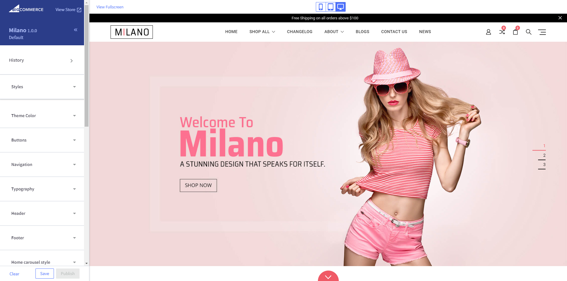
You can change the style of your theme from the Stencil Theme Editor. We’ll dig deep into this below, but for now, all you need to know is how to navigate to it:
Storefront Design > My Themes > Customize (it’s that big blue button next to your current theme).
Once you’re in, select Styles from the sidebar menu and you’ll be presented with your options:

Select the one that closest matches your vision for your store, click Save Changes, and you’re good to go!
Note that applying and saving a new style will overwrite your current style settings; however, you will not lose any content from your store. It’s always a good idea to have a backup copy of your theme before you start making customization.
Stencil Theme Editor
Once you’ve uploaded your theme and selected a style, it’s time to make it your own. While all of your products, collections, pages and marketing (including the slideshow) will be configured from BigCommerce dashboard, most of the changes you make to the look and feel of your store will happen in the Stencil theme editor. You’ll access it by navigating to Storefront>My Themes, and then clicking the blue Customize button under Current Theme.
You’ll notice that the theme editor sidebar menu is divided into a variety of sections:
- History
- Styles
- Typography
- Colors, and more.
We’ll cover all of them in the order that you encounter them below.
History
Much like the History tab on your web browser, the History section on your theme editor keeps a log of all the changes to your store since you first started building it. All of the entries are time stamped and include the name and version of the theme you were using. This is handy if you ever want to revert the settings on your store back to a previous version. Just select the version you want to use and click the blue Apply button in the bottom right corner.
Styles
Milano BigCommerce Theme comes with two unique theme styles that curate the fonts, colors, and general style of your store: Classic, Cool, Neon, and Warm. You can preview how they look in your store by clicking through the options in the sidebar and keep watching for the change.
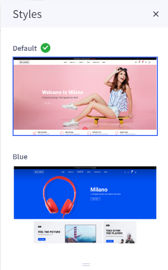
Once you’ve settled on a look, click Save Changes in the bottom right corner, and you’re good to go!
Note that applying and saving a new style will overwrite your current style settings, however, you will not lose any content from your store. It’s always a good idea to make a backup copy of your theme before you start making customizations.
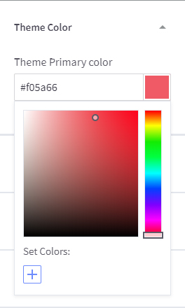
Theme Color
This will be the main color of your store. Once you change this color it will affect globally on major elements of the store like button background color, Right Sidebar title background color, icon colors etc. Basically, this will be the highlighted color of your store, so you can change the look and feel with your store by applying your desired color here.
By Default Primary color of our theme for Style Pink is #f05a66 and for Style Pink is #000
you can change the color from the drop-down color selector, which allows you to adjust and experiment with custom colors. You can also add a hex code as a text input if you wish. This can be helpful for matching colors across your site based on the logo and color branding.
Buttons
Here you can find settings for Apple Pay Button. It can also be customized in the Colors settings to show on your cart page as black, white, or black text with a white border.

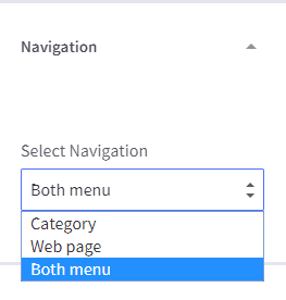
Navigation
This is the second part where the header is. Here the users will be able to interact with a navigation menu to reach website pages with great ease.
Here, you have a choice to display either Category Menu or Web page Menu on top navigation as well as Both Menus.
Tip: Try to keep it very minimized. More than 6 Menu items can kill the look of your store. You can display informative pages using a single section called “Company.”
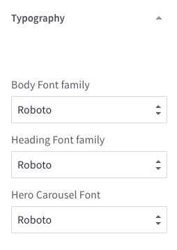
Typography
Milano comes with a selection of hand-picked fonts for your store. You can select the Body Font Family, Heading Font Family, and Hero Carousel Font from the corresponding dropdowns under Typography. Any changes you make will be automatically displayed in the preview.
Header
Header Pencil Banner
This is the section where you can highlight ongoing promotions or offer in short text. This banner will display globally across the site on all inner pages, like category product, cart, etc.

Enable Pencil Banner:
This checkbox gives you the option to enable and disable Pencil Banner easily from the admin.
Pencil Banner Text:
This field contains the text you want to display on the Pencil Banner.
Pencil Banner Link Text:
This field contains the text for a particular button. Example “Shop Now”
Pencil Banner Link URL:
This field contains the URL where you want to take the user to. Let’s say for example if you want to take a user to “offer” page of your website then it should contain “/offer/” as a URL.
Footer
This section is divided into 5 identical vertical partitions consisting of Contact Information, Navigation Menu, Categories, Popular Brands and Social Icons and Connect with Us. Learn more about each element below:
Contact: It will help your customers to know your company’s registered office address Email id ( you can change Footer Email id by Theme Editor > Footer > Footer Email ) and contact information. The address and phone number fields are dynamic which fetch the data from your BigCommerce profile.
The admin can edit the Email from this part by going in the Theme Editor and selecting the Footer tab.
Navigate: User experience is the key to success in this era of competition and navigation plays a very crucial role in defining the user experience. Hence, this navigation menu helps the user find the page of their requirement. This can consist of the pages like About Us, Blog, Contact Us, Sitemap, etc.
Categories: Making your product search easier by filtering them by the categories, like for a fashion store the categories can consist of Cloths, Special, Electronics, Medicare, etc.
Popular Brands: This navigation menu is built for the users who shop according to the brand.
Sign up for email updates: This section can also be called the newsletter section as the section is mainly responsible for allowing users to subscribe to the website’s newsletter. There’s an email field where users can enter their email address and then the subscribe button which adds the user upon clicking it.
Connect with Us: These come very usefully to establish your social presence, your customers and visitors can also help you spread the word using these social networking icons with your social profile links.
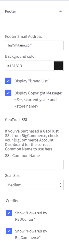
Footer Email Text:
Add the email address that you want to display on your store
Background Color:
Here you can choose a Background color for your footer section.
Show “Powered by PSDCenter”:
You can toggle the Powered by text using this setting.
Display Copyright Message:
You can toggle the copyright text using this setting.
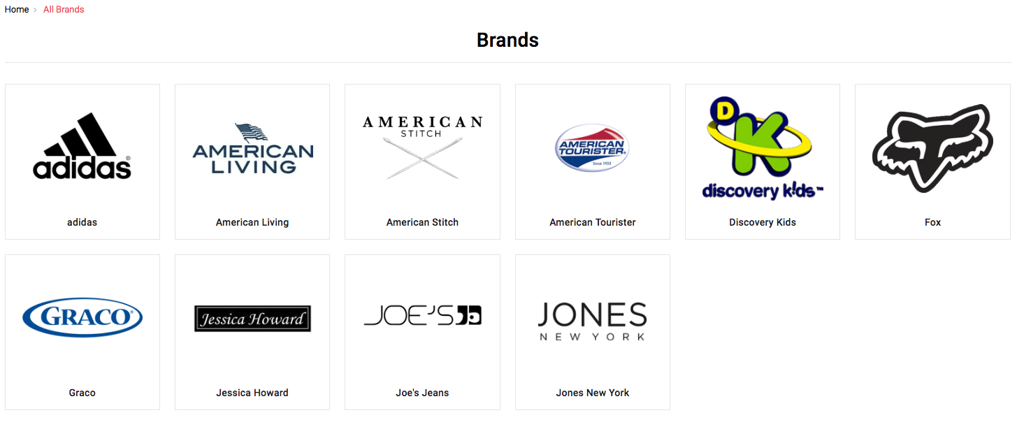
Display Brand List:
It will list out top 5 Brands in the footer with a “View All” link
GeoTrust SSL:
You can display the GeoTrust seal in the footer area by this setting. If you’ve purchased a GeoTrust SSL from BigCommerce, check your BigCommerce Account Dashboard for the correct Common Name to use here.
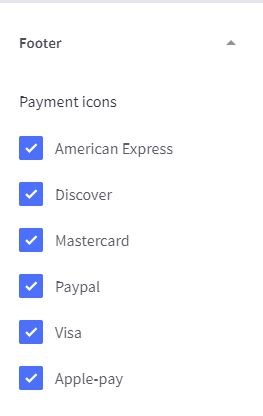
Payment Icons: These icons represent the accepted or supported payment gateways on the website.
The admin can choose which icons to display from the Payment Options tab of the Theme Editor.
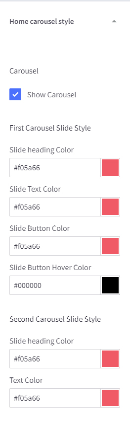
Home Carousel Style
Here we have provided some advanced settings for Homepage main Carousel. Which is normally not available on BigCommerce admin. Here you can manage Different text color for each text and slide. So basically using this setting you can apply different color for each slide that perfectly matches with your slide image. Also here you can enable and disable the banner without removing the slide image from the store setting.
USP Section(Unique Selling Points)
USP is a factor that differentiates your store and products from your competitors, such as the lowest cost, Free Shipping, Free Return, 24/7 Support.
Here you can manage the Title, Text, and Icons from the settings, Also you have the ability to choose a position(Top/Bottom) for the homepage.
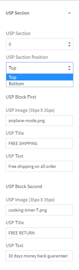
USP Image: Image/Icon name of the USP. You need to upload the Image from Image manger.
USP Title: USP Main Title
USP Text: USP Subtitle Title
Homepage Top Banner
Here you can manage the homepage Top Banner. We have two different styles available for the banner. You can also disable the banner by selecting none from the drop-down.
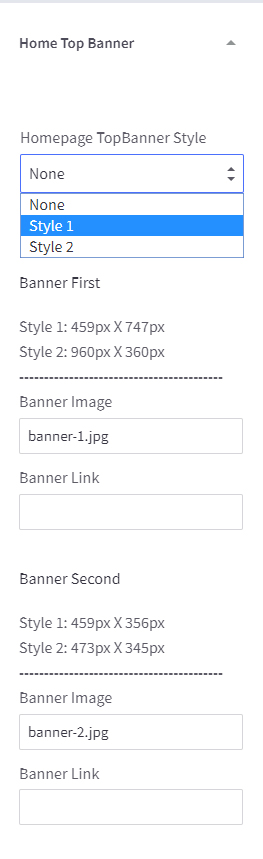
Banner Image: Image name of the Banner that you have uploaded from the Image gallery.
Banner Link: Link for the Banner will help the user to go to the specific category, product or page.
Storewide
Here you change the setting sitewide globally on the store.
Blog image size: It allows to set Blog Image size to optimize a for theme or specify dimensions.
Price Ranges: It shows the range of price options for products with variants.
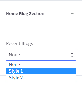
Home Blog Section
It allows you to display Recent blog posts on Homepage in two different layout style.
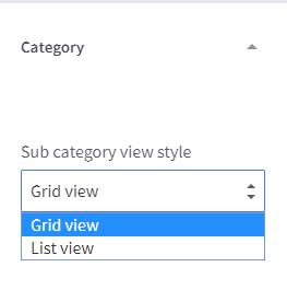
Category
Subcategory view style: Here you can choose the style for the subcategory view, you can set list and grid view from the setting. Grid view display subcategory link with image thumbnails.
Products
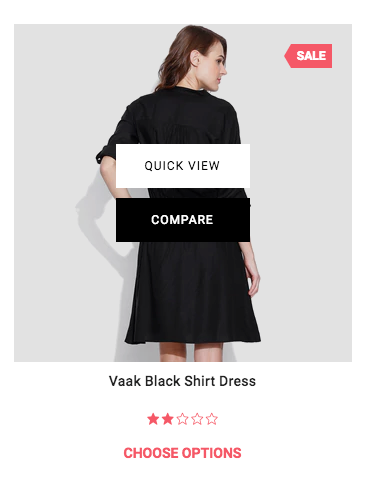
Show Quickview: It helps you to Enable the Quick View functionality.
Enable Product Compare: It helps you to enable the Product Compare functionality on your store.
Product Sale Price Label: Label for Sale Price
Product Before Sale Price label: Label for the default(MSRP)
Product Price label: It displayed when there is no sale price.
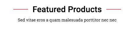
Sub Headings: It allows you to write a special tagline for the sections like Features Products, New Products, Recent Blog Section, Related Products, etc.
Product Count: Set how many Products you want to display for a particular section and Page, like New Products, Featured Products, Category Page, Brand Page, etc. You also have the option to display the section completely by selecting “Disable”
Show “Shop by Price”: It Displays the Shop by Price functionality on Category pages.
PRODUCT CARDS
Product Title Color — Changes the color of the product’s title when viewed on the home page, category page, or search result
Product Title Hover Color — Changes the color of the product’s title when you hover a cursor over it
Image sizes:
Please specify a maximum image size for desktop display. We’ll automatically scale down the image for smaller devices.

Main Product Images: Specify the image size of the main product image on a product’s page
Thumbnail Image: Specify the sizes of the thumbnail images that appear under the main product image
Zoomed Image: Specify the size of the image when zoomed in for a closer view
Image in Gallery View: Specify the size of product images when they appear on the category page, brand page, or search results
Brand Image in Gallery View: Specify the size of the brand image when viewed on the brands page
Optimized Checkout
This tab only appears if Optimized One Page Checkout is enabled. To enable this feature see Optimized One Page Checkout.
HEADER
Background Color: Change the color that appears behind the logo
Use Custom Background: Check this box to upload an image to display behind the logo. 1000 px X 400px is the recommended specifications.
LOGO
Use Custom Logo: Add an image for your logo. By default, it will inherit the settings from the Logo tab.
Position: moves the logo to the left, center or right side of the header.
CHECKOUT STEPS
Background Color: Change the color of the circle behind the number of steps
Text Color: Change the color of number of steps
ORDER SUMMARY
Background Color: Change the color of the persistent cart
PRIMARY HEADINGS
Font family: Change the font face for headings
Text Color: Change the font face for the heading text
SECONDARY HEADINGS
Font family: Change the font face for headings
Text Color: Change the font face for the heading text
BODY
Background Color: Change the color of the page
LINKS
Text Color: Change the color of links
Font family: Change the font face for links
PRIMARY BUTTON
Text Color: Color of the text inside these buttons
Text Hover Color: The color of the text in the button when you hover a cursor over it.
Text Active Color: The color of the text when the button is clicked. This usually displays very quickly, and may not appear in all browsers
Background Color: The color of the button behind the text
Background Hover Color: The color of the button behind the text when you hover a cursor over it
Background Active Color: The color of the button behind the text when you click on it
Border Color: The color of the line around the button
Border Hover Color: The color of the line around the button when you hover a cursor over it
Border Active Color: The color of the line around the button when you click on it
Font family: Change the font face for buttons
SECONDARY BUTTON
Text Color: Color of the text inside these buttons
Background Color: The color of the button behind the text
Border Color: The color of the line around the button
Font family:Change the font face for buttons
FORM LABELS
Text Color: Color of the text inside forms in checkout such as the payment method
FORM INPUTS
Text Color: Color of the text typed into fields (Payment Method)
Background Color: The color of the field behind the input text
Shadow Color: The color of the slight shadowing on input fields
Placeholder Color: The color of the text example in an input field.
Border Color: The color of the line around the input fields
Input Control Color: The color of the active selection indicator on forms
Error Color: The color of the text that appears when incorrect or missing information is put into an input field
FORM CHECKLIST
Background Color: The color of the field behind the selection options. (Shipping Methods)
Selected Background Color: The color of the text active selection option
Text Color: The color of the text in the selection options
Border Color: The color of the border of the selection list
LOADING TOASTER
Background Color: The color behind the text on the loading notification.
Text Color: The color of the text on the loading notification.
Recommended Image Sizes
Our theme will look beautiful with below-recommended image sizes and will work perfect on all the devices like Desktop, Laptops, iPads, and Mobile.
We strongly recommend you to use below-sized images for best view.
- Home Page Carousel:
Style 1 (Default): 1920px X 900px
Style 2 (Blue): 1920px X 700px - Home Page Top Banners:
Style 1 (Default)
Banner First: 459px X 747px
Banner Second: 459px X 356px
Banner Third: 459px X 356px
Banner Fourth: 459px X 747px
Style 2 (Blue)
Banner First: 960px X 360px
Banner Second: 473px X 345px
Banner Third: 473px X 345px
Banner Fourth: 465px X 720px
- Home Page About us Banner:
Style 1 (Default): 700px X 476px
Style 2 (Blue): 700px X 406px - Blog Images:
800px X 500px - Category Page Top Banner:
1124px X 130px (Height can be any). - Product Thumb Main Image :
1280px X 1280px - Logo Size
142px X 45px
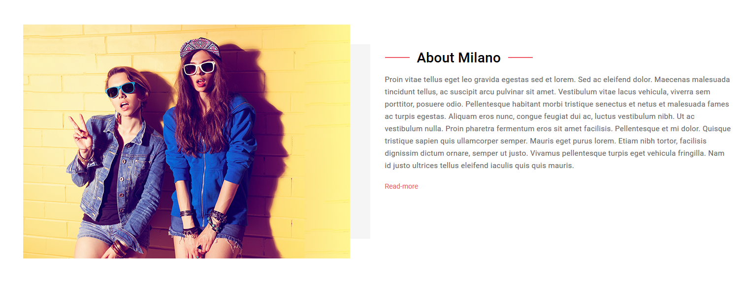
Homepage About Section
A slightly different banner from the generic banners, consisting of a combination of image and text both which makes it more elegant and appealing. Hence called the marketing banner, a store owner can customize, add new marketing banners from the Store Admin > Marketing > Banners. You need to set banner as Bottom Position.
Please Use the below Sample HTML to set About section structure as per the Demo.
<div class="about-us-section m-b-50">
    <div class="custom-row about-contain-main">
        <div class="columns large-6 medium-12 mob-large-12 about-contain">
            <div class="about_us_img">
                <a href="#">
                    <img src="https://store-a5hpniv.mybigcommerce.com/product_images/uploaded_images/about-us.png" alt="">
                </a>
            </div>
        </div>
        <div class="columns large-6 medium-12 mob-large-12 about-contain">
            <div class="about_us_contain">
                <div class="section-title">
                    <h1 class="page-heading"><span>About Milano</span></h1>
                </div>
                <div class="about_us_contain_inn">
                    <p>Proin vitae tellus eget leo gravida egestas sed et lorem. Sed ac eleifend dolor. Maecenas malesuada tincidunt tellus, ac suscipit arcu pulvinar sit amet. Vestibulum vitae lacus vehicula, viverra sem porttitor, posuere odio. Pellentesque habitant morbi tristique senectus et netus et malesuada fames ac turpis egestas. Aliquam eros nunc, congue feugiat dui ac, luctus vestibulum nibh. Ut ac vestibulum nulla. Proin pharetra fermentum eros sit amet facilisis. Pellentesque et mi dolor. Quisque tristique sapien quis ullamcorper semper. Mauris eget purus lorem. Etiam nibh tortor, facilisis dignissim dictum ornare, semper ut justo. Vivamus pellentesque turpis eget vehicula fringilla. Nam id justo ultrices tellus eleifend iaculis quis quis mauris.</p>
                    <a class="read-more" href="https://store-a5hpniv.mybigcommerce.com/about/">read more</a>
                </div>
            </div>
        </div>
    </div>
</div>
Additional Resources
If you’re setting up a BigCommerce store for the first time, we highly recommend heading over to their site and take a look at their support resources and BigCommerce University video series. Also, you can directly reach out to us by submitting a support ticket from the form below or Theme Support Page
Here are a few articles that cover the basics of setting up a store:
Release Notes
Oct 26, 2018 v1.0.2
- Bug: Fixed issue with Wishlist count not showing on header in some pages
- Bug: Product page – Login for pricing text still appearing in the related product section even user already logged in.
- Bug: Optimized checkout order confirmation page logo not showing
- Enhancement: Added option in Theme Editor for footer text color
- Enhancement: Added option in Theme Editor for footer social media icon color
Oct 10, 2018 v1.0.1
- Theme Launched
Review Us
If you like this theme, please support us by sharing your reviews and rating us 5 stars. To review our services or to give rate our theme, please follow this URL : https://partners.bigcommerce.com/directory/partner/129287/psdcenter.